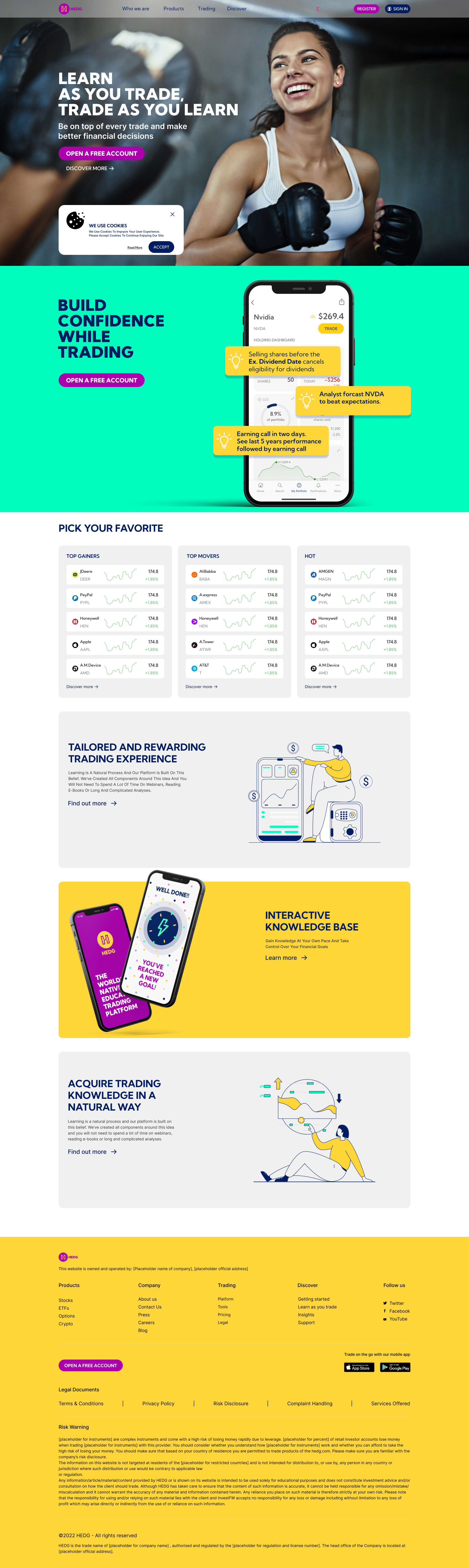
Why Fintech Companies Keep Losing the Trust War Before the First Click
Your product might be safer than a bank. Your returns might be better than any fund. But if your brand doesn't signal credibility in the first five seconds, none of that matters. Here's what most Fintech companies get wrong about trust, and what to do instead.

The Wealth Management Rebrand Checklist: 12 Things Most Studios Forget
Rebranding a wealth manager is not like rebranding a consumer app. The stakes are different. The audience is different. Here's what the checklist should actually look like.
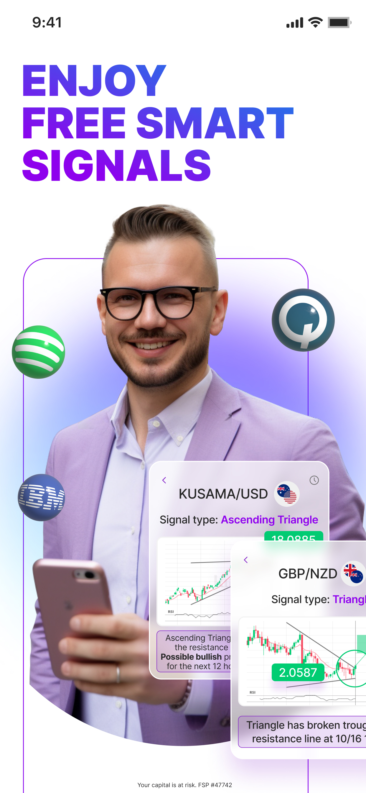
What a Trading App Dashboard Teaches You About Fintech UX Priorities
The moment a user opens your trading dashboard, they make a judgment about your trustworthiness. Not consciously, viscerally. This is what that means for how you design it.

The LinkedIn Profile That Closes Deals Before the Meeting Starts
Fund managers and Fintech founders spend years building credibility and 20 minutes building their LinkedIn profile. Here's how to fix that imbalance.

Why "Looking Professional" Is the Wrong Goal for Your Fintech Brand
"Professional" is a floor, not a ceiling. Every competitor is trying to look professional. The brands that win are the ones trying to look authoritative, trusted, and inevitable.
Colour Psychology in Regulated Finance: Why Blue Isn't Always the Safe Choice
Every Fintech uses blue. Every Wealth manager uses dark navy. The colour that signals "trust" now signals "same as everyone else." There's a better strategy.

How Premium Brand Positioning Lets You Charge 3× Without Losing Clients
Premium pricing is not about being expensive. It's about creating a perception where the price becomes irrelevant compared to the cost of not choosing you.